
Building a United “Lightbox”
In the process of meeting with product teams, the Atmos team noticed several groups asking a similar question, “How might we display our products in a more inviting way?” We had an abundance of beautiful marketing images provided by our brand team but the system was lacking a meaningful and consistent way to utilize them. What emerged was a specific variation of a popup modal, meant to highlight images, videos and other visual content. Tentatively, we labeled this component “The Lightbox.”
*This is a highlight of one pattern in the Atmos Design System. Read more about the Atmos System before diving in.

Role & timeline
While collaborating with the Atmos team, I took the lead on the creation of this component. I hosted several workshop sessions with 4-5 product designers and consulted our dedicated developers early on. As the component came together structurally and visually, we met a few times to iterate and refine.
From workshops to dev-ready, this project took approximately a month and a half.
Discover
A broad wishlist
While listening in workshops one thing became clear, this needed to be a highly-adaptive component. One group needed the ability to compare, another was hoping to include videos and walkthroughs. Flexibility went to the top of the list.

An on/off switch
However, balancing flexibility and consistency is not an easy feat. To accommodate various use-cases, nestled in a shared goal, we settled on the idea of a defined set of child components (image selection, optional sticky footer) that could be turned on and off within the larger parent that is the overall Lightbox.
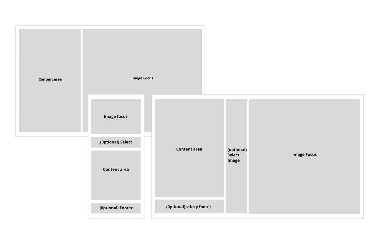
The ability to adapt
With different views in mind, we then worked to stack, arrange and nestle the child components in a way that responded seamlessly from screen to screen. Included in this, was consultation with an accessibility designer to make sure the design adapted intuitively to assistive technologies.

Research
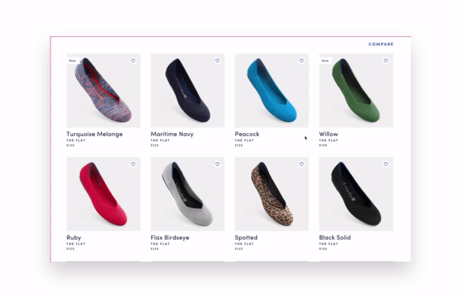
When looking for ideas out in the wild, Rothy’s came to mind. I had just been shopping for shoes and remembered this pop-out experience from their website. As a team (product, design, development), we gathered examples like this and brought them together for review.
In this example, we liked the large and inviting images, the static information area, and some of the accessibility considerations on both the front and backend. Like the “Click to zoom” reminder.
Though the functionality is slightly different, this example and others were used as both visual and structural inspiration for United’s lightbox.
Design & Development

The wireframe
Before layering in images and content, we started with the dynamic structure that we had agreed upon as a cross-product team. We wanted to make sure sections turned on and off and stacked intuitively.
This structure was iterated upon in multiple workshops and made stronger by many thought-provoking accessibility flow discussions.

A complexity cut
Originally we had designed the image to sit on the left of the modal (similar to Rothy’s), as much of the team preferred this visually. We also toyed with the idea of allowing the user to turn on a tabbed experience within the modal. However, as we iterated upon the structure in workshops, it became clear that both of these decisions would increase development and accessibility complexity.
While this was meant to be a visual experience, the written content was the most important piece in regards to both perceiving and understanding this experience. This led us to the collaborative decision to push the content section to the left and to eliminate (for now) the tab functionality.

Just the basics
Eventually, we landed on a very basic foundation for this customizable component. First and foremost, it would be a simple modal that provides the ability to share one beautiful image.
This is the variation would be for a product designer/team wanting to provide a simple up-sell to a nicer cabin or it could function as a highlight for a new type of onboard product.
When collaborating with the design system manager and developers, we decided that this would be the first iteration and additional features would follow.

Multiple images and videos
The long-term goal was to arrive at a multi-faceted component that allowed for the selection of multiple images, support of a sticky CTA section, and future support of videos as content.
These additions would help designers call out specific aspects of an experience. An example of this could be using the lightbox to highlight the many features of United’s Polaris cabin.
But these variations also open the door for a ton of creativity. The lightbox was designed to facilitate the use of our exceptional image library but the endless possibilities for this component really come down to designer imagination.

Publishing the component
At United, we operated from a code-first model. Meaning that a component wasn’t ready for consumption until it was built into the Atmos code repository.
From there, we would take our previously created designs and any learnings from our discovery phase and use that to craft the documentation and useable symbol in the sketch library. With the development releases we would also release the symbol, documentation and an explanier message in slack.

Making it accessible
Modals are notoriously tricky, they need to be clearly defined as a seperate experience , images must be handled with care and there has to be a defined exit plan. To help guide us in the right direction, we reviewed a number of competitors that seemed to be doing it well, including Amtrack, Rothy’s, and Glossier. We also collaborated with our in-house accessibility designer for those finer details.
Overall, we wanted to make sure that no matter the device or technology used, that this experience could be perceived, operated, and understood. We thought through focus order, verbal instructions for use, the exit strategy and much more.
This research helped to build guidelines around proper use and fed into our documentation for the component.
User Feedback
The creation of this component grouping, sparked a lot of discussion on the Atmos team and collaborating product teams. We discussed content line length, directional button placement, consistent image sizing/quality and the many struggles that come with making an interactive modal, accessible. All of these discussions, in their own way, fed back into the system, helping us to develop documentation for not only this use case but many others.
Conclusion
This component was just moving into development as I was leaving United. We planned on releasing the simplest version first, monitoring its use and bugs, and then adding additional features in future releases. For example. the seats team was gearing up to build a plane walkthroughs experience (similar to 3D home walkthroughs on Zillow or Redfin). We had begun to discuss with them how this component (or a variant of it) could potentially support that experience. We had also started collaborating with the research team on a plan to run this through specific usability testing, which would be a first for United.
Working through this component helped us to refine the Atmos process. We learned a lot about how individual designers wanted to interact with the system and how to include them in the process. It was also a great exercise in facilitating cross-team collaboration and encouraging teams to think both locally and globally.