Bit Space style guide
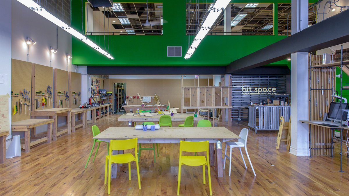
Bit Space is a youth-only maker lab located in Chicago. They provide education outside of school on wood working, 3D design, VR design and much more.
Role and contribution
I worked with Bit Space on a short contract as a UX/UI Designer to update their style guide, organize their site structure and create a model for their new curriculum offering. I partnered with Bit Space guides and management for content and photography.
Refining the style
When I started working with Bit Space, they already had established branding with an existing website. However, they wanted to develop a more defined system and differentiate their public style from their corporate style. I performed a competitor analysis and realized that Bit Space was much more hands-on and industrial than similar organizations in the area. In addition to their logo green, I brought in two additional colors to add liveliness, give accessibility options and establish a primary call to action. I also wanted to highlight the playful photography of their students.
A path forward
Because this was a short-term contract, I provided Bit Space with a style guide, a site structure and a number of visual reference comps and wireframes. These tools were meant provide a solid template and to help guide Bit Space as they work through future projects and design updates. Below are a few of those references.